I’d rather have the old style with this (like in battlelog), it will only cause spam in the future when someone decides post for example 10 posts in a row
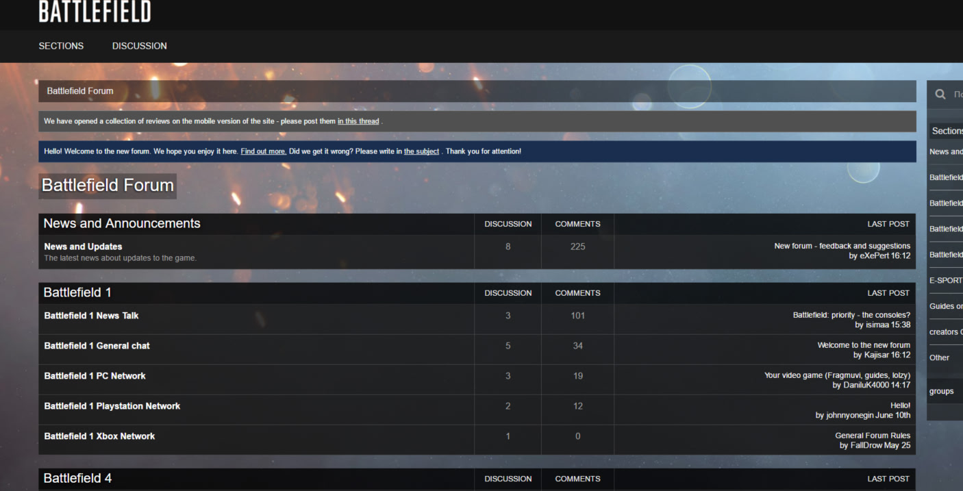
I know it’s already been mentioned, but please, give us a choice to change that black background. I honestly can’t browse the forum for more than a few minutes before my eyes get tired and my head starts to hurt.
If they do exceed that amount of posts in a row, it will be considered as spam. I wouldn’t worry too much about it.
Please add the feature that the forum users here will be linked with their Battlelog profile!
The “Flag” or reporting a post functionality no longer works. It’s been this way for about a week now. If there are no plans to fix this, then perhaps removing the “Flag” wording under each post might be in order.
editing posts it’s purely…change it
The site should updates like adding the chat and stuff don’t understand the hate now for the site.
Love how they now locked the old forums when the new one is cleary pre-alpha… facepalm
yeah, seems like they don’t care at all. This style gives my eyes cancer by just looking at it, not to mention that it’s scroll hell. Are you targeting the 80+ old player, or why is everything so big?
Why do you rush the transition from the BL forum, when this still looks like ?
The BF4 forum was a perfect mix between looking good and not getting a headache. It literally makes my dizzy and that is coming from a dude playing with 120fov and a fast sensitivity. Clear it up. This is literally unusable.
whos idea make blank forums? first time someone doing forums?
and is tons of bad already that battlelog
Constructive feedback is great. Feel free to elaborate on “is tons of bad already” so we can continue to work and improve the forums for the community.
@TripleDotszz We have our Brand team working on some background imagery to add some pizzazz to the forums.
-Braddock512-
still this. the spacing in posts really needs an overhaul.
I’ve mentioned this on the RIP thread that the black background / white text combination is giving me eye strain - other people are getting this also. I want this forum to be a success but it seems as though it was rushed out without any thought or testing.
The black background is really destroying the experience for me as well. That would be by far the worst aspect of the current version. I used BBLog on the old Forums and I put a nice (relatively) bright picture for the background. That really lights everything up and simply changes the mood completely. Whenever I see screenshots from other people with dark backgrounds, I die a bit inside.
Maybe the best way would be to let each user choose their preferred background picture or color scheme.
Picture I use with BBLog:

My picture isn’t showing all of a sudden and it’s through gravatar.
A lot of padding. Huge amount of empty space and only about 1/3 of screen width used. This is not this day, this is some ancient style. Aiming this forum to someone not able to see well by having big contrast, waste of space? This looks like someone just started to practise HTML5… Come on, you can do better than this!
What do you guys thing about something like this?
(We’re testing various styles/looks for various regions)
-Braddock512-
It looks much better than the current style.
this looks much more appealing and doesn’t hurt the eyes so much.