will there be a mobile app version ?
On the main forum menu, I notice there is a cog next to each forum, if offers 2 options, mark as read and hide.
If it’s possible to make an ‘Add to Favourites’ option and store our favourites at the top of the forum page, that would be mint
Just curious if there’s an ETA on BF3, BF4 BFH stats being reattached to our profiles in the near future? Maybe our profiles can hold a link to BFstats.com? Or something along these lines?
crazy decision not to link this in with battlelog where all our information and stats etc about each other is.
the visual layout of this forum compared to old is awful as well.
Everyone’s go-to feedback.
Forum is looking nice minus the private messaging and layout
offtopic but what is your profile picture?
Not sure of this new forum layout.. seems like a lot of wasted space… therefore LOTS of scrolling… not a fan.
Not bringing over old content (meaning tips, tricks, help threads, etc.) is just bizarre and short sighted and can really have no valid explanation… but I am all ears.
Mods on this forum are just odd
…this is a game I, and others, paid for. Now you want “us” to work together to improve this forum. How about taking some of that money and putting some focus groups together BEFORE you come out with something new… is there a Product Management org?
…attitude is beyond comprehension sometimes, mods/admins are customer service oriented but come across like their skin is made of tissue paper some times… whether you are paid or not makes no difference, you are a “face” of the organization.
Links to Battlelog stats (or whatever will be used for stats) should be included when clicking on the tname of a forum member… or add a link under the name… no brainer.
I will think of more, but that is my impression after the first 5 minutes of use…
Here is the best feedback you’ll ever get :
bring back Battlelog Forums.
Its not bad. Its manageable.
Still need to get a better background and theme. Grey and grey is bad for my eyes.
Oh and I cant seem to change my avatar 
I click on the picture in y profile where it says “change picture” and a white box comes up, and nothing happens 
Go to your Preferences > Change My Picture > Choose File. Once you’ve selected your picture spam-click the Upload button. It will be uploaded even if you get the red error, just refresh to confirm.
Veteran players, from 1942/BF2 etc, should have it in their ‘‘title’’…somehow…lol.
Seemed to work. Thanks.
Let the blackberries live on!
my eyes hurt and i think we all kno y ;_; miss old forums
or just use gravatar…
Can someone answer my question as to whether you are porting all the old forum posts into an archive area. It seems stupid building up such a wealth of useful knowledge to then just dump it all completely.
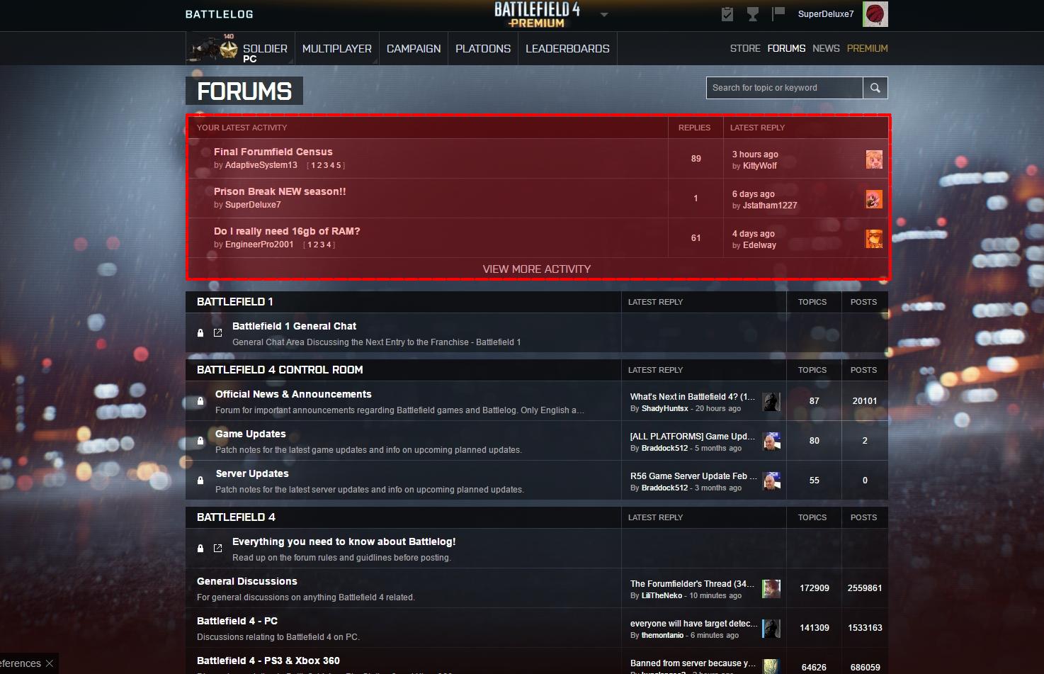
Interesting, just saw that.
I can still Like and Comment on my Platoon page, but I can’t do any of those on anyone’s Battle Feed (profile). I can only update my status.
@Cryphisss and @Hessuniemii I had the same issue where once you typed “:” the menu would simply follow you and reappear even after you pressed Escape. However, I just tried it and the menu seems to disappear once you hit Space.
The Russian version looks way cleaner, pleasing to the point that I actually want to look at it instead getting literally a headache and getting spinning in my head with this theme. It also works both at day and night time unlike BF3 which looked fine during the day but was one bulk of light during night time playing.
This looks like an oversized comment box under a news article.
But if this theme is going to stay I’d like to have the Searchbar, Categories and Who’s online scroll down as well.
pros:
a lot more features, tracking, link, edition, etc
cons:
my biggest grip is the waste of space. too many empty lines and too large paragraphe border.
it looks like the ui is designed for mobiles. i prefer more horizontal layout, and less scrolling
suggestions:
would like a preference menu for customization: let give options for the tree menu position (left or right, minimized/maximized), extended or flat mode, font size etc
actually the tree menu on the right occupies too much room, 1/3 of the screen, and we should be able to minimize it to get back all the screen width for displaying text